 |
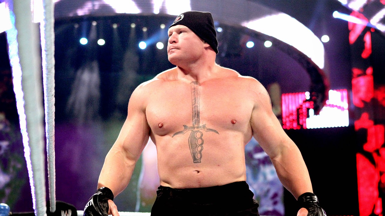
| Even before he fights, Brock Lesnar gives off such a cold, remorseless vibe by his look Photo Credit: WWE.com |
In any kind of sequential art, be it comic books or animation, character design is integral to the success of a character. The character is almost always seen long before it does much of anything, and the design has to capture and deliver its core to the audience quickly. It's hard to think of a comic character more iconic than Superman, and his design is a large part of why he's stood the test of time. Everything about his design tells you everything you need to know about him before he even does anything. He has a gigantic shield on his chest, and that, above everything else, embodies him. He's here to protect. His hair has an S, and his boots have an M. On top of that is his name. Superman is not only a description of his abilities, but of his morality. He is a super man. He was the first real superhero, and his look is the foundation for everything in superhero comics. His costume is simple, blue tights with red trunks on top, emblematic of circus and carnival strongmen, with pro wrestling deeply rooted in the same carnivals and circuses.
Character design in wrestling is completely unique to athletic performance. All other combat sports generally stress the competition, but what is really warring in wrestling are the personalities, the characters. Boxing and especially mixed-martial arts have tried to mime this in recent years, but cannot match the theatricality of wrestling, which simply allows for more depth in character. I mentioned earlier the importance of good character design in sequential art, but it's true for the same in live performance. However, a character cannot be crafted the same way, drawn differently to suit the artist. This leads us to what is usually described as a wrestler's “look”, but even that can be sculpted by mannerisms, costume, haircut, makeup, and tattoos.
A simple example can be seen in the main event of SummerSlam, Brock Lesnar against John Cena. Lesnar is a mammoth man, covered in muscles. He looks menacing while standing still. He has short cropped hair. His haircut is not fashionable, an implication that it is cut that way for utility. His shirt is simple text, declaring “EAT SLEEP CONQUER REPEAT” in stark black and white. His shorts are identical to those he wore while competing in the UFC, branded with Jimmy Johns' logo. Those shorts accomplish two things, reminding that this man is in it for money, and that he has a celebrated history of violence. Lastly are the matter of Lesnar's tattoos, which all further the story told by everything else you see in this man. A ghastly skull covers his back, while a sword covers his chest, pointing at his throat. He is a cutthroat, who is here for war. His name is simply his name, but even that seems crafted for this purpose.
His opponent, John Cena, strangely, is almost the yin to Lesnar's yang. He's obscenely muscular, with a similar haircut. It, however, along with the dog tags and military salute, put forth the image of a soldier. This is married to the overall aesthetic of his shirt, which loudly and proudly proclaims “Hustle Loyalty Respect” or “Never Give Up” in bright colors. He has multiple armbands on his wrists and elbows, softening his image, making him look more cartoonish. His shorts are denim, the much insulted jorts. However, they serve a purpose, further grounding him as an everyman. The bright colors, lack of tattoos, the jorts, the military ties, all further support this image as a hard worker, a man who is dutiful and humble. His name is simply his name, but all menace that could be implied with it isn't there. Cena is crafted to be dangerous because of his persistence and determination, not because of his dangerous personality.
Design aesthetic is so important to both comics and professional wrestling because a character's design is the first and most visible portrayal of who and what they are. You see a superhero long before you hear them, and the majority of a wrestler's time is spent wrestling, telling a story without really saying a word. Layers of overlapping simple choices can make a character likeable or villainous, all without them uttering a word.